
Bye-Bye Brown: A Look at the New Interior Concept for the Winnebago Intent
Observing first-hand that Winnebago cares about customers' opinions is the main reason we chose to buy a Winnebago RV. In 2017, we attended an RV conference called the RV Entrepreneur Summit, and we were surprised to see members of Winnebago's product team in attendance, taking notes on all the feedback being thrown their way!
While attending this year's RV Open House and Winnebago Launch in Elkhart, IN, we happily noticed that Winnebago is at it again. They showcased a number of concepts built around customer feedback. The one that stood out to us the most was the new interior concept for the Winnebago Intent.
The brand new, light and airy interior is still only a concept, which means it's not available for purchase yet. But, Winnebago is listening and is looking into making this an option. Take a look at the main features of the new design and be sure to leave your comments below.
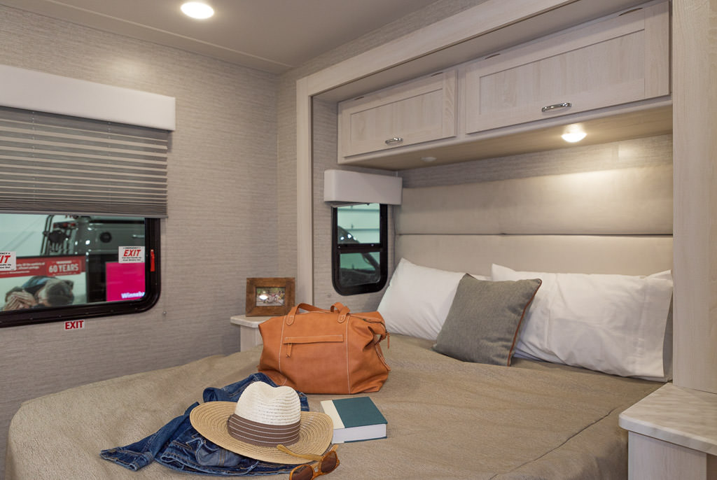 The contemporary style moldings on this interior concept's slide are free of scrollwork or intricate embellishments. The shaker style cabinets share the same clean lines.
Bye-Bye Brown
Upon entering the Winnebago Intent, a Class A gas motorhome that debuted last year, you immediately notice the interior is not brown. Motorhomes and campers in the U.S. tend to be dominated by brown tones on the interior. However, a quick search on Pinterest or YouTube for RV decor or renovations will often show that browns are often repainted, reupholstered, or ripped out. Customers hoping to save themselves the work have asked for lighter, more contemporary interiors and that's exactly what you get when walking into this Intent's interior concept.
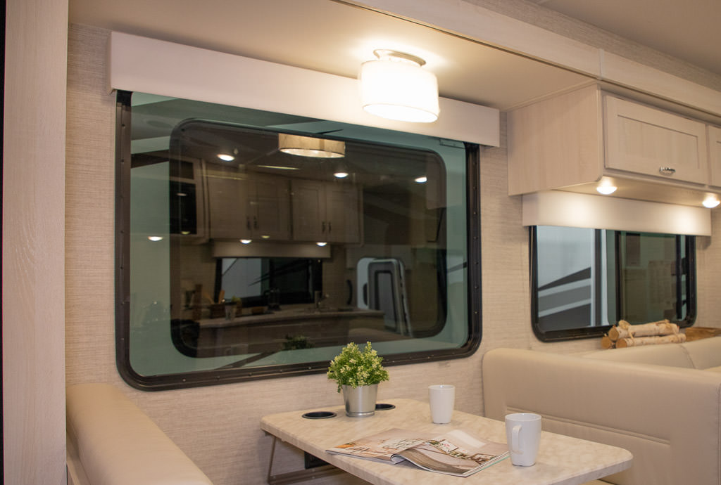
The browns have been replaced with warm, off-white neutrals. The end result feels homey -- like a beach house approved by Joanna Gaines, of HGTV fame. The interior also felt more open, thanks to the light-colored walls and ceiling. (For a tour of this new Intent interior, click here.)
Endless Possibilities
The off-white neutrals allow you to add your own personality to the RV's interior. Like in a home, pillows and throws are often used to add a personal touch to an RV. With the light neutrals, accents in just about any hue will look right. Personalize and add contrast with teal, navy, coral or any color you like.
The tufted headboard in the bedroom was also neutral, providing a blank slate for bedspreads and pillows. A closer look at the white valances revealed a clean look with no padded embellishments or pre-chosen patterns.
If you walk in hoping for the valances to provide the character in the RV, you might be disappointed. However, we suspect the valances were designed for those who find themselves ripping them out, recovering them, or begrudgingly choosing the lesser evil of the pre-selected fabric patterns available.
A downside to the more brown-dominant RV interiors is the lack of contrast. And overall, a limited amount of customization. In a general sense, many consumer trends show that people like to customize and personalize. This new interior concept provides the perfect foundation to personalize to your heart's content.
More Options
But what if your heart would rather customize a little less and have some of the contrast already added for you? There was also a gray fabric swatch on hand to show an alternate upholstery color.
The light countertop's 'marble' look perfectly complemented the contemporary beach-house feel of the interior. But, if you prefer a darker countertop, there was a swatch to show a gray option that could be available for the countertop as well.
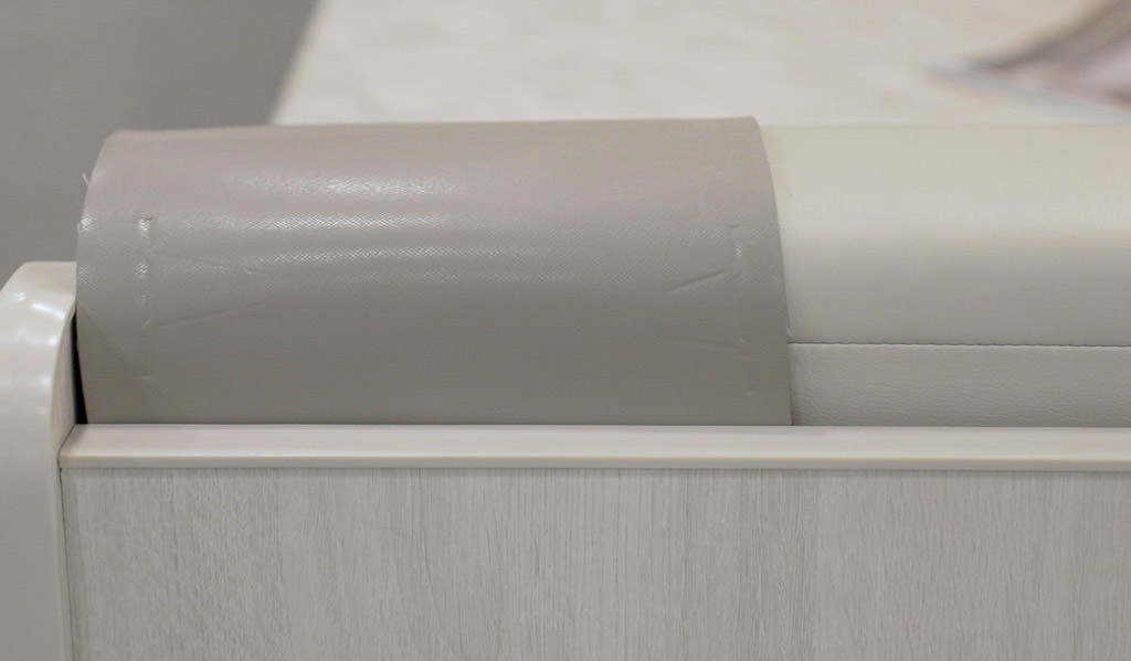 A gray neutral is a second option for the upholstery. The gray swatch in this picture gives an idea of what that could look like.
Contemporary Design
Many RVs tend to feature traditional design. This is reflected in scrollwork or intricate designs on moldings, particularly on slides and cabinets. That works out great if you're a fan of traditional decor, but there have been few options for anyone who's a fan of contemporary design.
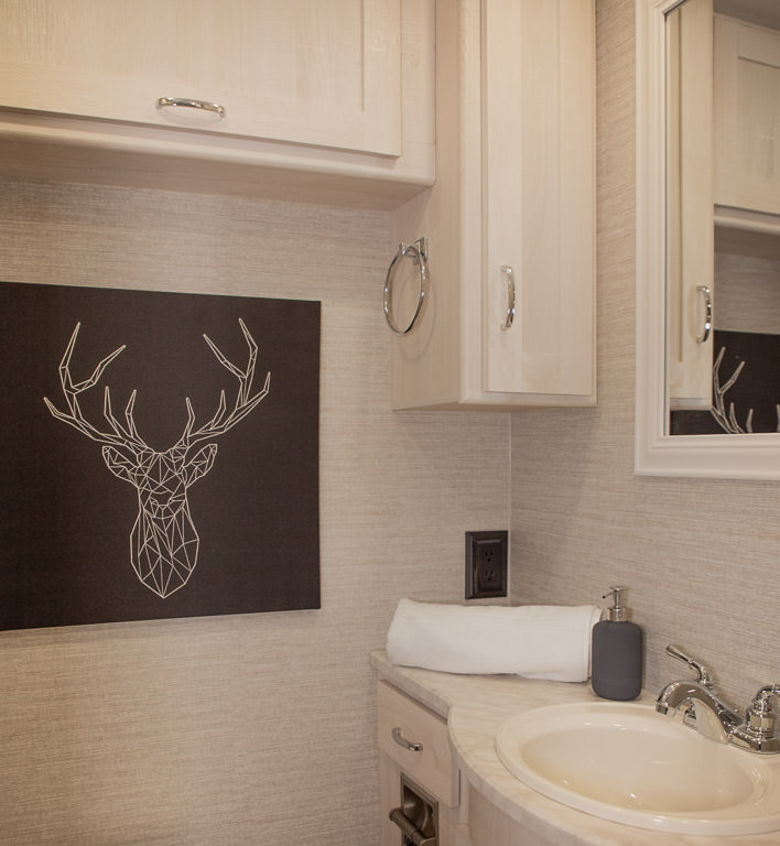
The new interior concept in this Intent addressed that with clean lines throughout the RV's interior. The molding on the slide-out was clean, modern, and contained no scrollwork. The valances and lampshade were also clean and modern. The cabinets were shaker style cabinets.
Our RVs are our homes away from home. We don't all decorate our homes the same. Yet, until now, our RVs have largely shared the same decor style. This new interior provides the kind of options we're used to outside of the RV world.
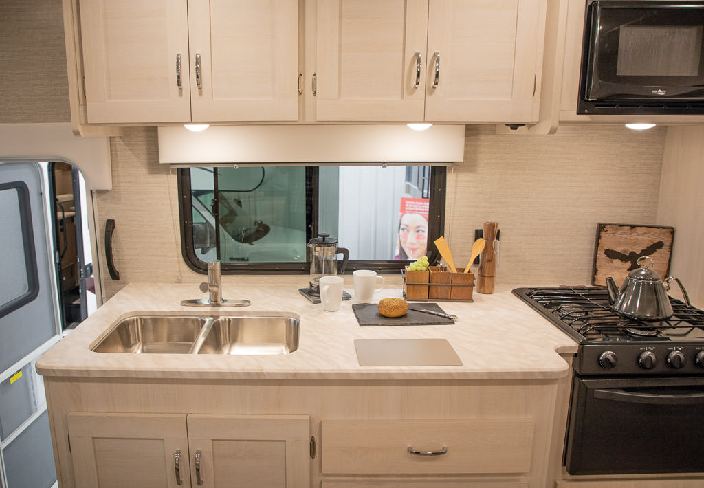 The countertops have a "white marble" look that complements the rustic beach house feel of the interior. A gray countertop option is also available, swatch shown below cutting board in this photo.
Your Turn
This is your chance to let Winnebago know what you think. How do you feel about this new more contemporary look? Would you change anything? Would you like to see this option in a diesel pusher, Class C, towable, or any other type of RV? Please leave your feedback in the comments below!
Comments
Comments on this post are moderated, so they will not appear instantly. All relevant questions and helpful notes are welcome! If you have a service inquiry or question related to your RV, please reach out to the customer care team directly using the phone numbers or contact form on this page .